I use design & technology to help companies embrace digital change and reach their potential

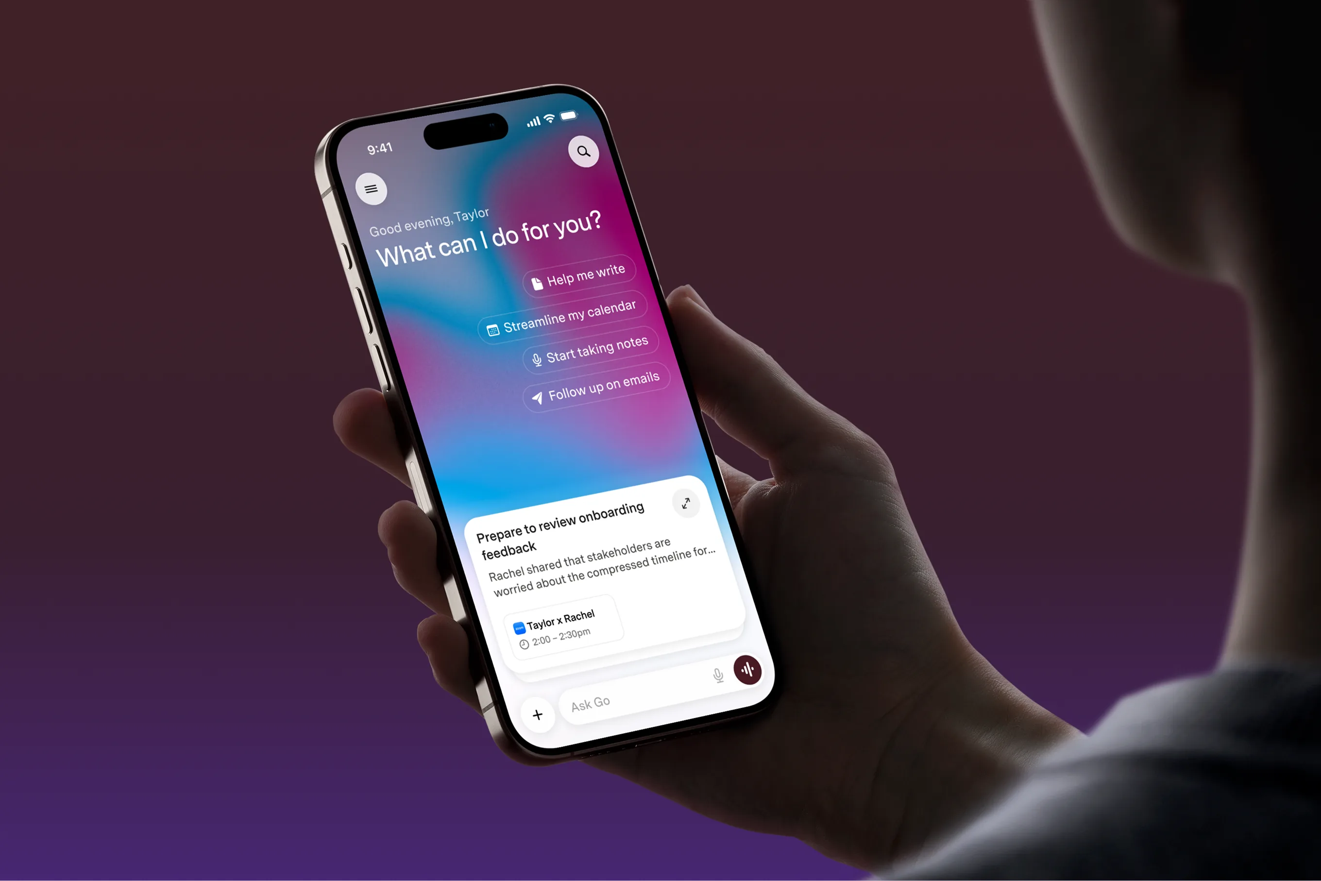
Superhuman Go assistant interface on a phone held in one hand
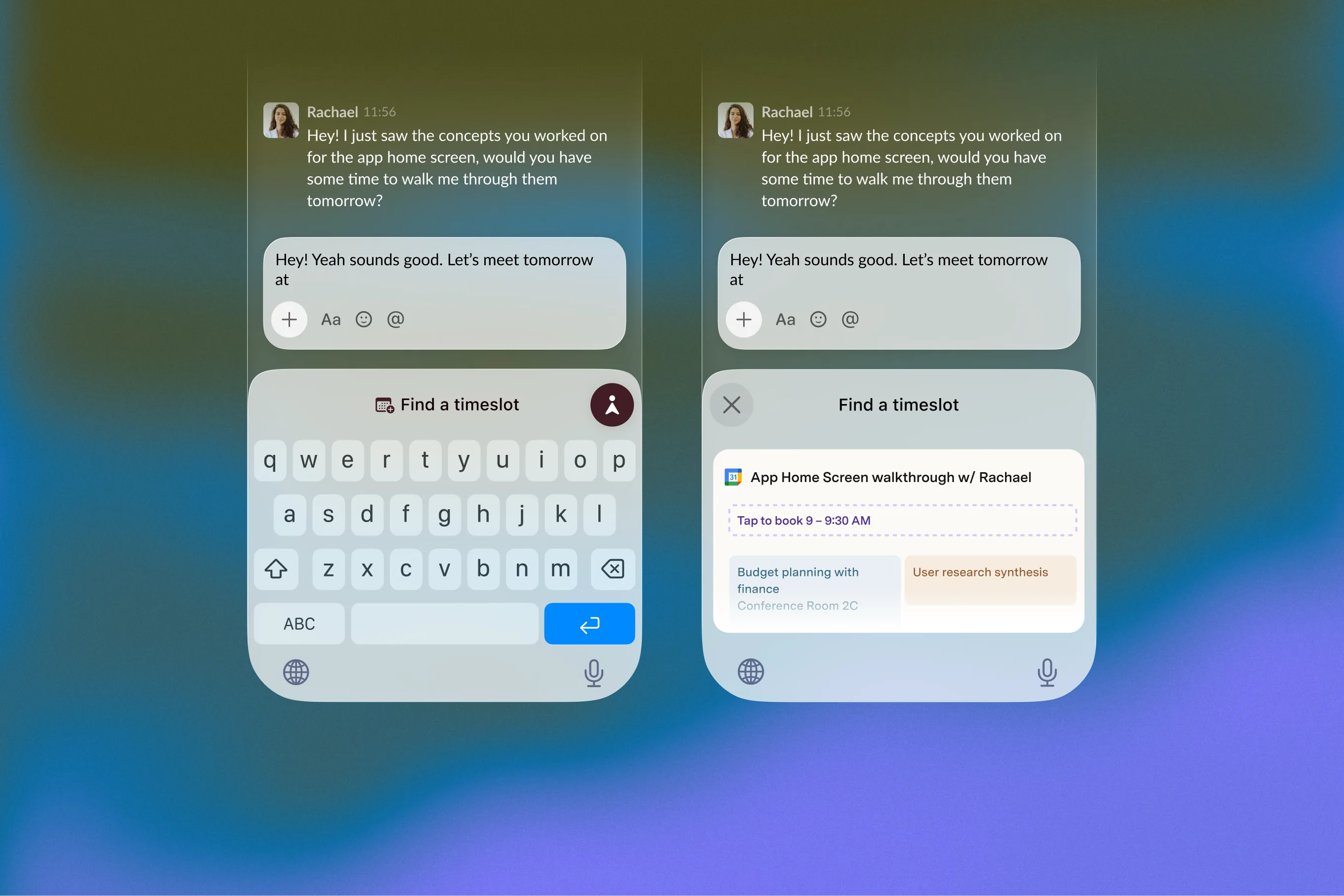
Superhuman Go mobile interface screens

Superhuman

We partnered with Superhuman to provide a fresh take on their vision for 2026 and beyond.

Introduction & Context

Towards the end of 2025, we joined Superhuman as a design partner to help shape the vision for its mobile ecosystem. With no ramp-up time, we moved quickly from early ideation and stakeholder interviews into prototyping and delivery, producing a substantial body of work in just three months.

My Role

The project began across two parallel tracks: exploring ideas without the constraints of a fixed brief, and developing key personas through interviews with stakeholders across Superhuman. These personas evolved into three primary user journeys.

My focus was Superhuman Mail, where I helped translate the wider product vision into a clear and considered mobile experience. Alongside this, I explored how the Grammarly keyboard could evolve into Superhuman Go—a proactive AI assistant designed to offer contextual support across the apps and websites people already use. This became a focused side project, developed in close collaboration with Superhuman’s iOS tech lead to better understand the technical constraints and opportunities of bringing that experience to mobile.

Design Approach

Given the scope and compressed timeline, I worked in short, focused cycles—developing ideas, sharing tangible work and refining the direction through regular feedback. Maintaining momentum was essential. By putting new work in front of the client frequently, I was able to test assumptions early, build alignment and move the product forward with confidence.

Takeaways

The AI landscape has shifted significantly since this work began, and some of the thinking may already be evolving alongside it. That pace of change was one of the project’s most valuable lessons.

I’m proud of the depth and volume of work delivered in three months. The project also strengthened my understanding of complex product systems and how to navigate them at speed without losing sight of the user experience.

Credits

Roxane Hassler, Kevin Cannon, Ed Silva, Roman Tysiachnik
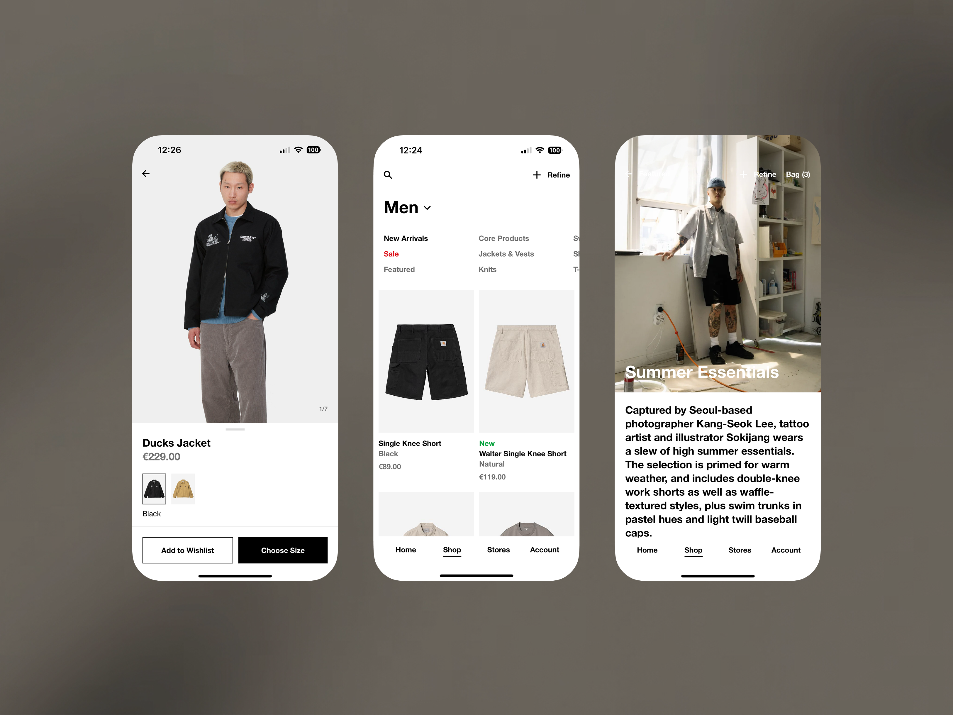
Carhartt WIP app product and editorial screens
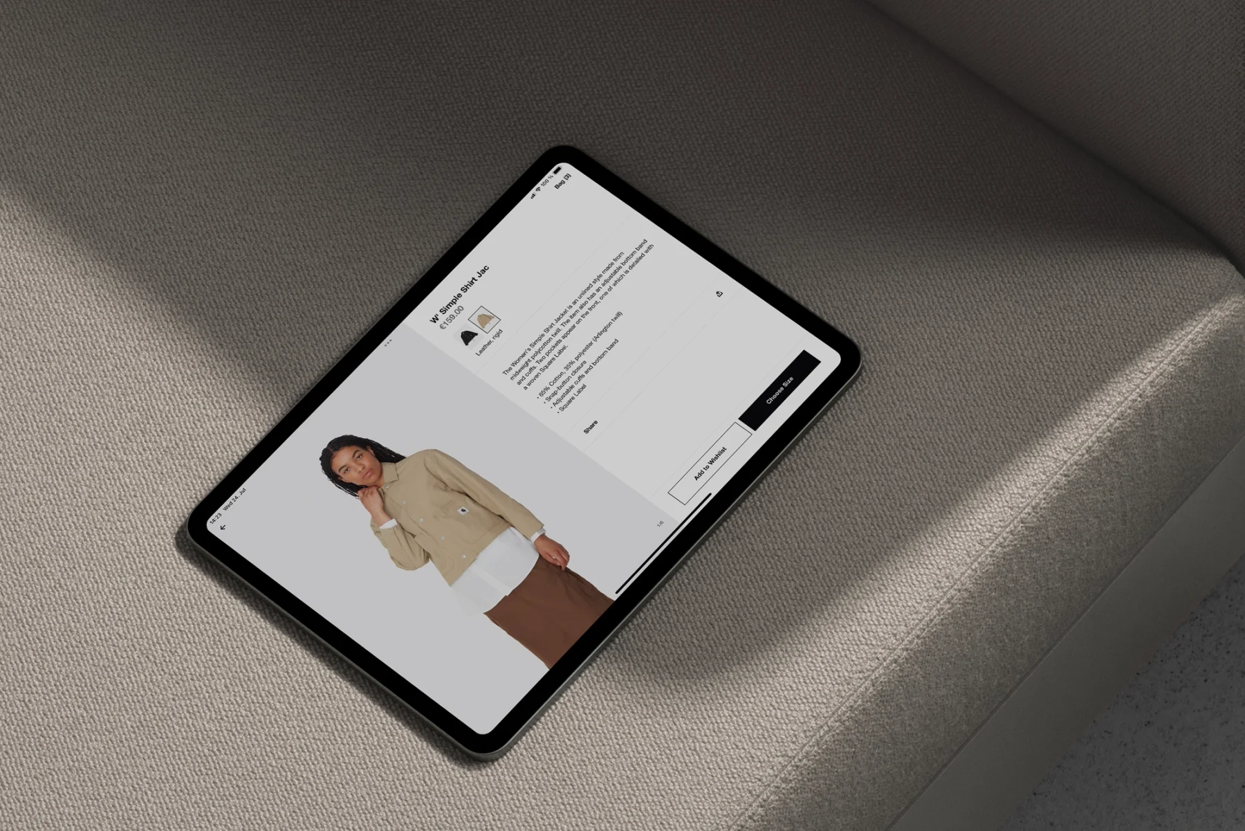
Carhartt WIP shop displayed on a tablet

Carhartt WIP

Creating a digital ecosystem for the streetwear brand: a new app, B2C shop and B2B platform, all built for internal ownership.

Introduction & Context

Carhartt WIP has always occupied a distinctive place across music, skateboarding, art and fashion, but its digital products didn’t yet reflect the same clarity or cultural relevance.

We joined as a long-term design partner to rethink how the brand showed up across its app, consumer shop and wholesale platform—creating a more connected experience that Carhartt WIP’s internal teams could own and continue to evolve.

My Role

I’ve been embedded within Carhartt WIP’s product team since 2024, working across its consumer, mobile, and wholesale experiences.

My work on the B2C platform has covered core journeys such as purchasing, discovery, alongside editorial modules and supporting pages including sustainability, Carhartt WIP Radio, and the editorial archive.

Within the app, I focused primarily on the relationship between content and commerce—exploring how editorial stories could lead naturally into product discovery.

Since 2025, I’ve also led the design of the B2B marketing hub, shaping the product from its core structure and workflows through to the finer details of the experience. The platform gives retail partners access to the content and tools they need to present Carhartt WIP consistently across their own channels.

Design Approach

We designed a connected ecosystem spanning the app, B2C shop and B2B platform, with shared patterns and a flexible foundation that Carhartt WIP’s teams could manage and evolve themselves.

Working as part of an embedded team means my role often extends beyond design. I take an active part in shaping priorities, aligning stakeholders and turning broad requirements into clear, achievable steps.

I work closely with product managers and engineers throughout the process, sharing work early and using regular feedback to keep projects moving. This helps maintain momentum across parallel work streams while ensuring decisions remain grounded in user needs, technical constraints and the wider product strategy.

Takeaways

The work has resulted in a modern, scalable website and app, supported by strong customer satisfaction and conversion rates. More importantly, the shared design system has created a clear foundation for future projects—allowing new features and experiences to be developed more quickly without losing consistency across the wider ecosystem.

Credits

Lutz Erian, Theresa Schmidt, Tom Marks

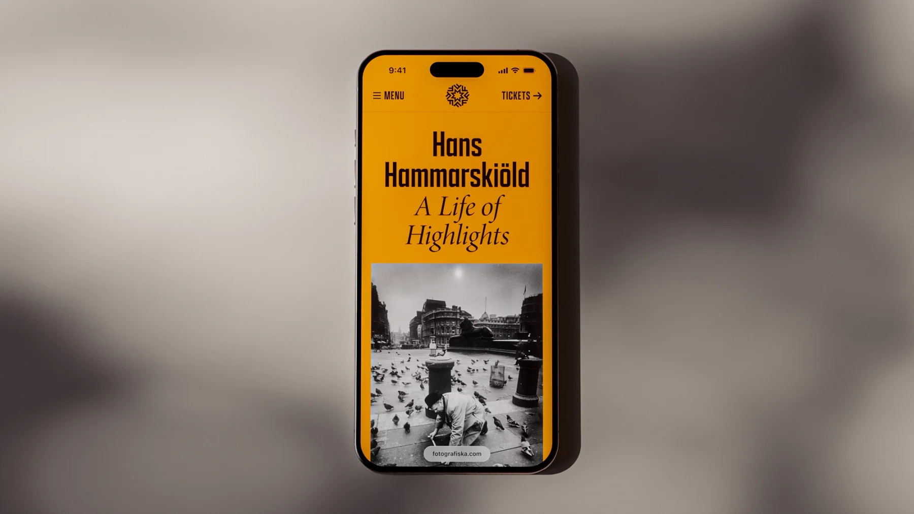
Fotografiska exhibition page on a phone
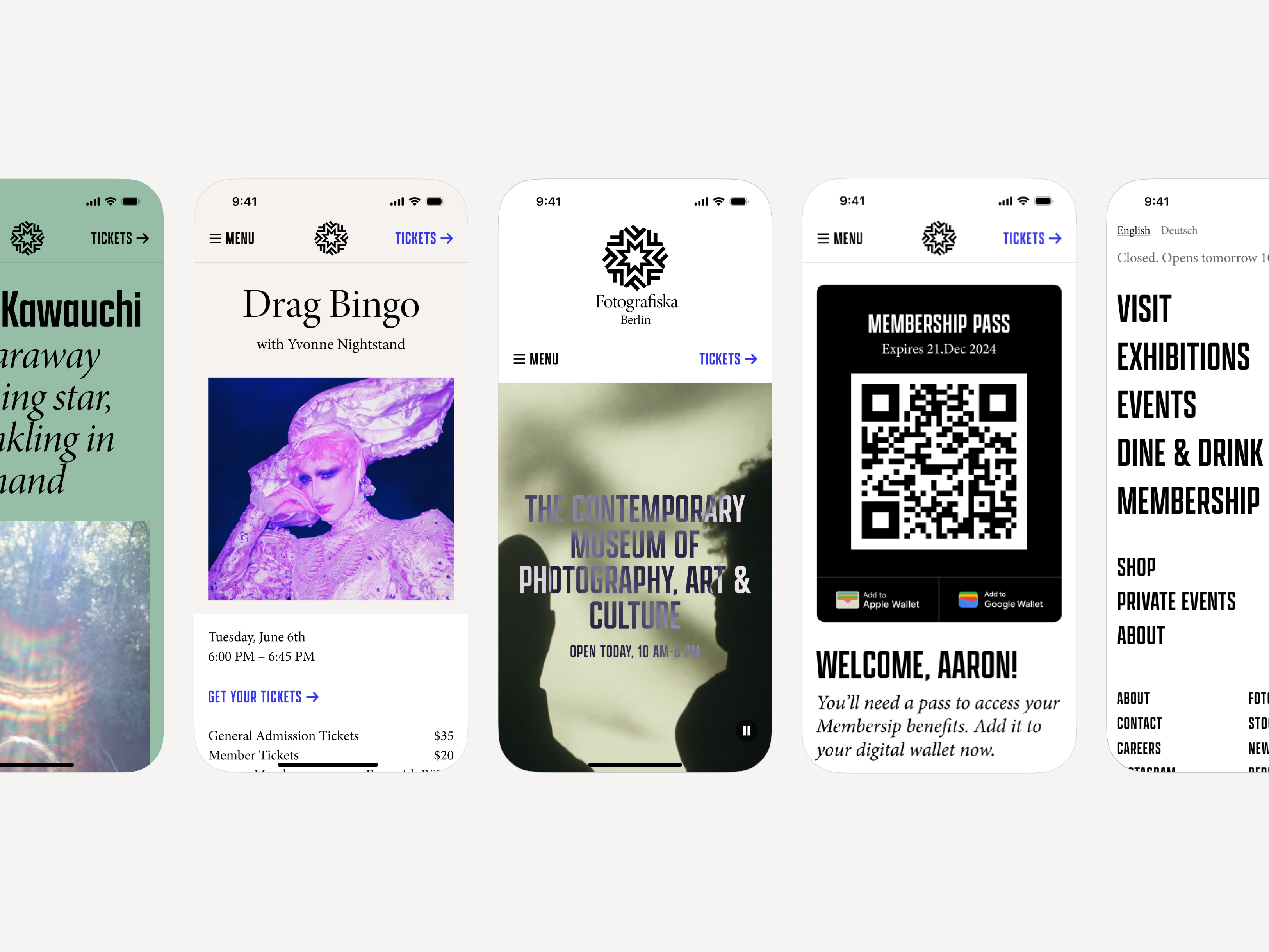
Fotografiska mobile website screens
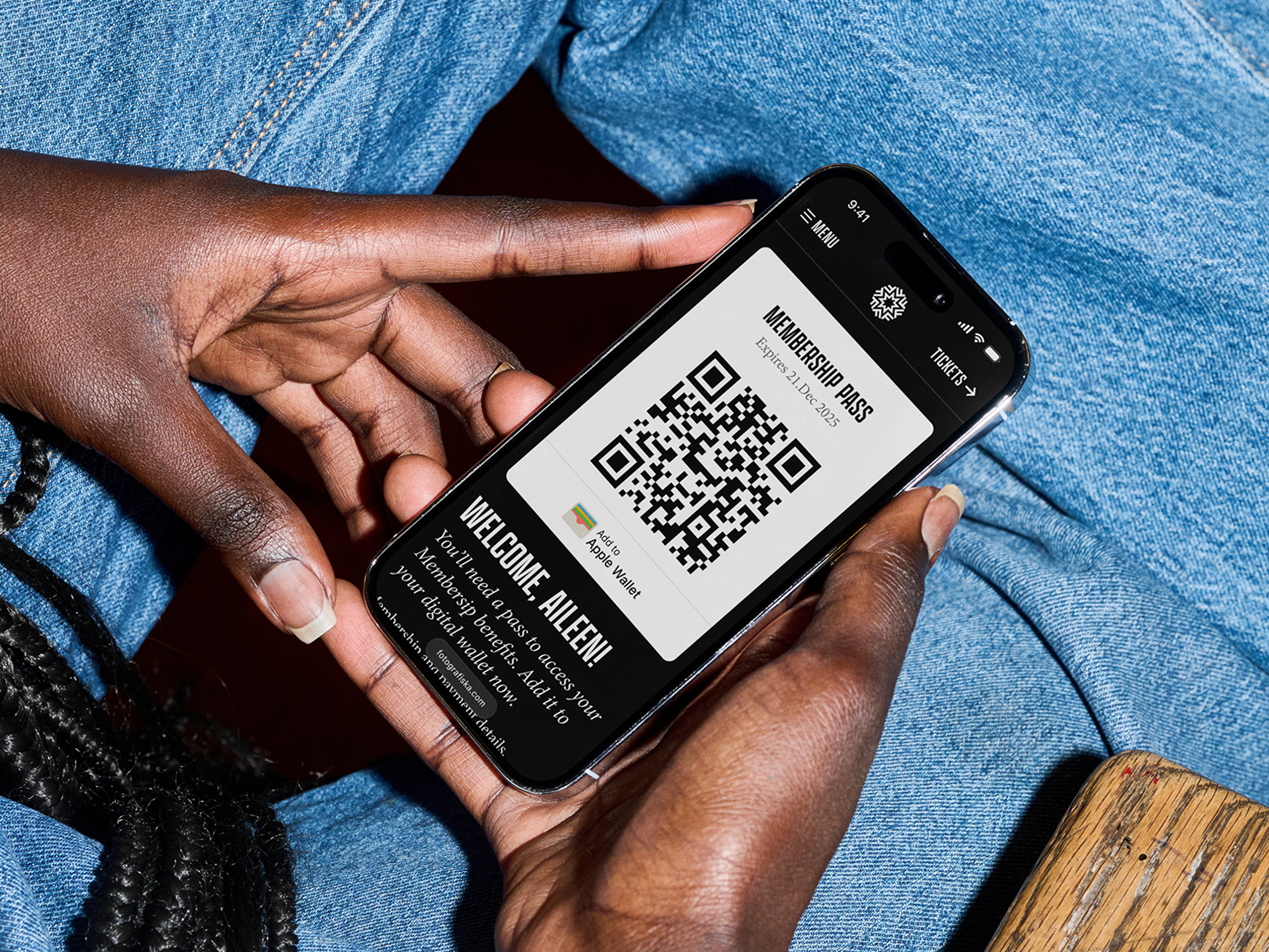
Fotografiska membership screens on two phones

Fotografiska

A digital home for curation and collection for the global photography museum.

Introduction & Context

Fotografiska is a global photography museum with spaces in cities including Stockholm, New York, Tallinn, Berlin and Shanghai. As the organisation prepared to open its Berlin location, we worked with the team to rethink its wider digital presence.

This meant relaunching the global website, creating flexible experiences for each location and establishing a foundation that could support future growth. The aim was to give the artists and exhibitions more space online while making practical tasks—from planning a visit to becoming a member—feel part of one coherent experience.

My Role

I worked across several parts of the experience, designing flexible content modules and the visit page, while leading the design of the membership flow—from discovering the benefits through to joining. The process needed to feel clear and consistent while working across Fotografiska’s different locations.

Design Approach

As a photography museum, it was important that the work remained the main focus. We designed a restrained, flexible system that gave exhibitions, artists and imagery room to lead, while making practical information easy to find and creating a familiar experience across every city.

We also wanted the site to be more than a companion to the physical museums. It needed to function as an online archive in its own right—one that could preserve and surface Fotografiska’s programme beyond the limits of bricks and mortar.

Takeaways

The project showed how a digital platform can support a physical experience without being limited by it. By establishing shared patterns across cities, we made practical journeys such as planning a visit and becoming a member feel familiar, while leaving space for each location to retain its own character.

The same system gave exhibitions, artists and photography a longer life online—creating a foundation for an archive that could continue to grow alongside Fotografiska’s programme.

Credits

Victor Gustafsson, Güzin Mut

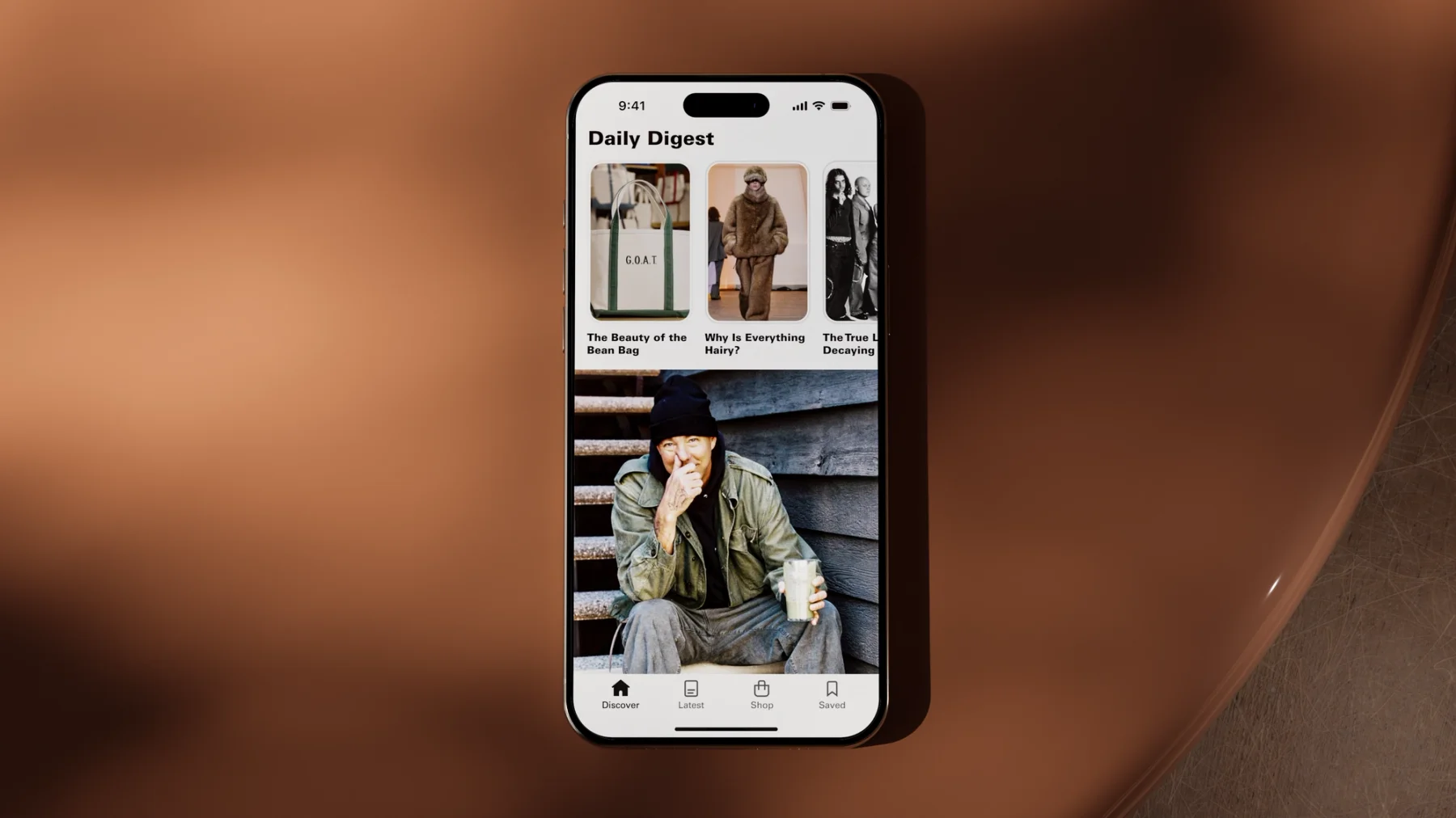
Highsnobiety Daily Digest on a phone
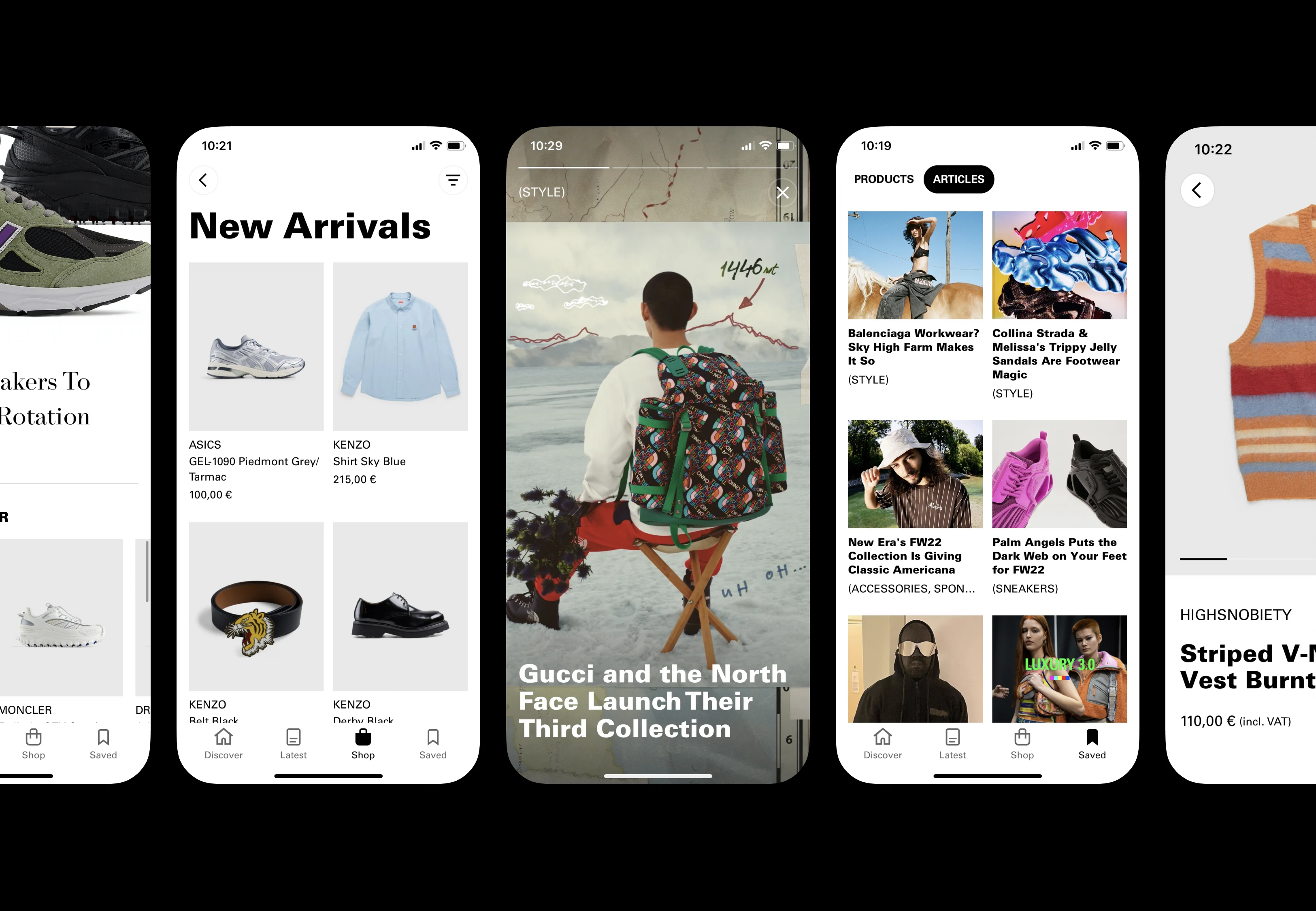
Highsnobiety editorial and shopping screens

Highsnobiety

Designing a shopping app rooted in editorial thinking.

Introduction & Context

Highsnobiety had spent close to two decades building its voice across fashion, music, art and culture. We joined the team to explore how that editorial point of view could translate into a mobile product for its most engaged readers.

Rather than recreating the website as an app, we worked together to define what the format could offer on its own—bringing editorial discovery, saved content and shopping into a more direct and personal experience.

My Role

I focused on designing the ecommerce experience, exploring how shopping could sit naturally alongside Highsnobiety’s editorial voice rather than feeling like a separate part of the product.

I led a series of customer interviews to better understand people’s behaviours and needs, using those insights to shape the core journeys. I also worked on a more story-driven experience that could support Highsnobiety’s editorial approach and create stronger connections between content and commerce.

Throughout the project, I worked closely with key stakeholders across the business—from product owners through to the CEO—sharing work regularly and building alignment around the direction of the product.

Design Approach

The central challenge was bringing editorial and ecommerce together without either feeling compromised. Rather than treating content and shopping as separate experiences, we explored how stories could become a natural entry point into product discovery and purchase.

This meant designing sales journeys that began with context and inspiration rather than a conventional product grid. Products could be introduced through the people, ideas and culture around them, creating a new way to shop that still felt recognisably Highsnobiety.

The design itself was kept deliberately simple and modular. A clear, scalable system gave the editorial team room to tell richer stories while allowing content and commerce to connect in different ways as the platform evolved.

Takeaways

The project reinforced that editorial can be more than a layer applied to an ecommerce experience—it can shape the entire journey. By beginning with stories rather than products, we created more considered paths into commerce that reflected how Highsnobiety’s audience already discovered brands and ideas.

It also showed the importance of keeping the underlying system simple. The more flexible and scalable the foundation became, the more freedom the editorial team had to experiment without losing consistency or making the shopping experience harder to understand.

Credits

Harry Manion, Philipp Triebel

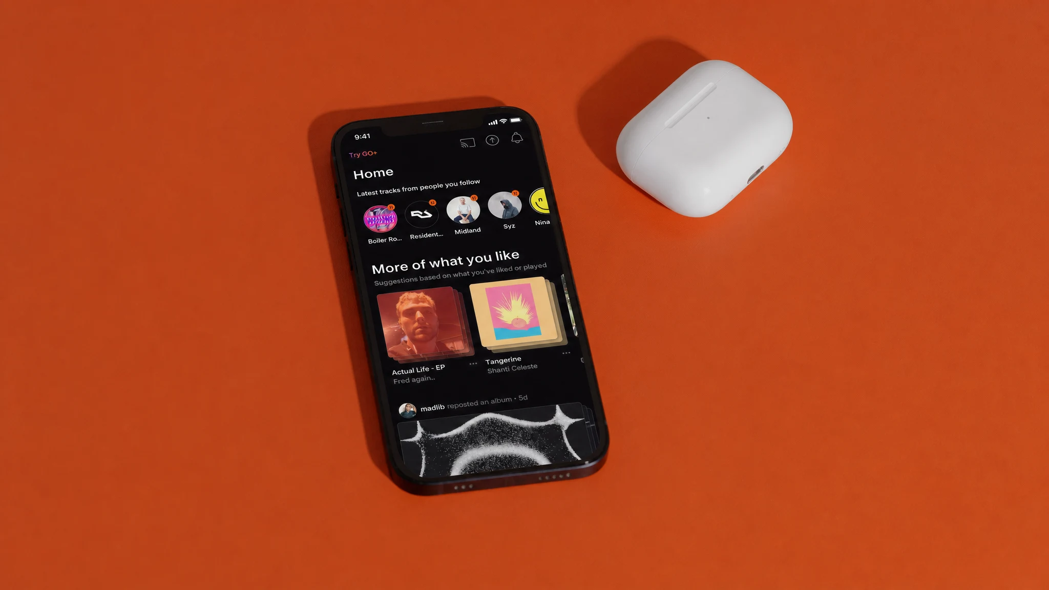
SoundCloud mobile app on an orange background
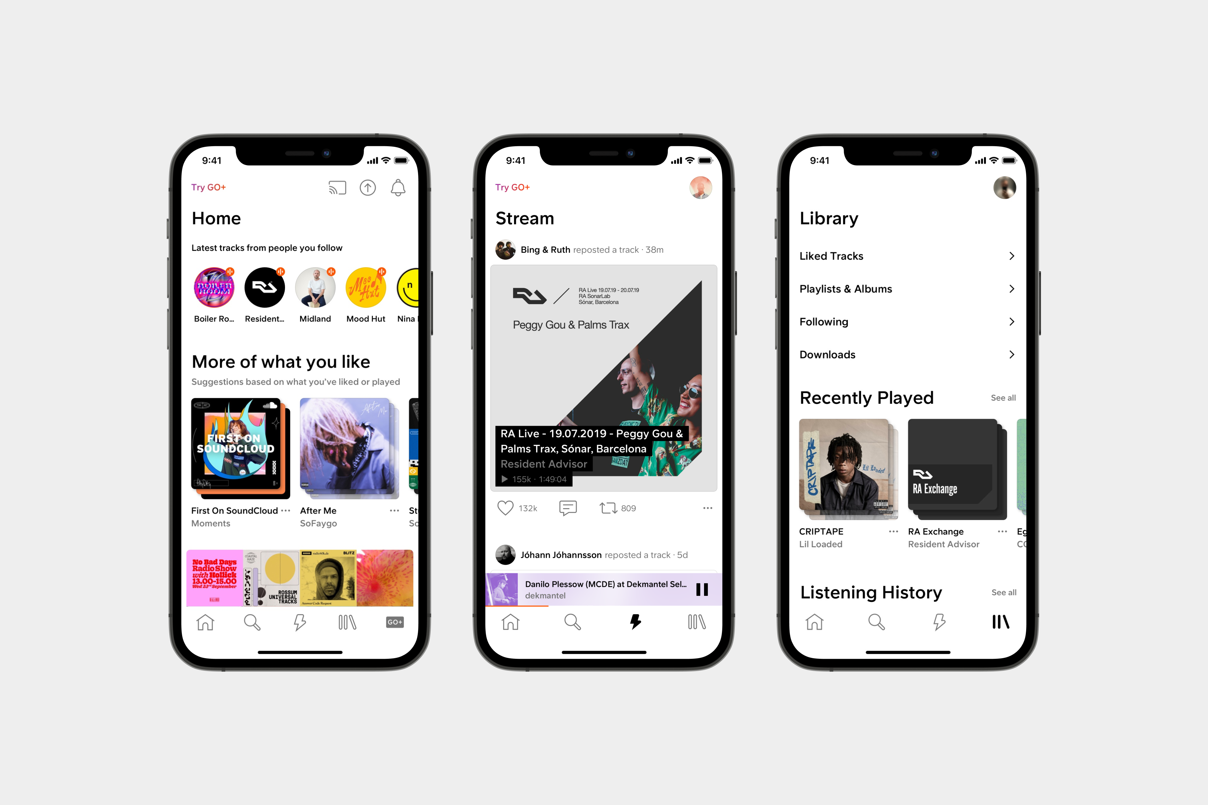
SoundCloud home, stream and library screens

SoundCloud

After years of incremental changes, we partnered with SoundCloud and redesigned their web and mobile experiences to further enable millions of creators and listeners worldwide.

Introduction & Context

After years of incremental product changes, SoundCloud’s web and mobile experiences needed a clearer and more consistent foundation. We partnered with its product teams to develop a new design language that could work across every platform and support millions of creators and listeners around the world.

The challenge was to bring structure to a large and complex product without losing the openness and character that made SoundCloud distinctive in the first place.

My Role

SoundCloud was my first project at A Color Bright. I worked on scaling the design system into a foundation that could support the product across the web app and iPad, in both light and dark modes.

I delivered key reference views that helped define how the system would work in practice. My focus included some of SoundCloud’s most important experiences—the player, profiles, streams and feeds—ensuring that shared patterns remained consistent while adapting to the needs of each part of the product.

Design Approach

We took a system-led approach, but developed it through real product experiences rather than designing components in isolation. Key reference views allowed us to test the visual language against the complexity of the player, profiles, streams and feeds, refining the system as new needs emerged.

The aim was to create consistency without making every part of the product feel the same. Patterns needed to work across screen sizes, platforms and light and dark modes, while leaving enough flexibility for different types of content and interaction. This gave teams a shared foundation they could apply with confidence as the product continued to evolve.

Takeaways

The project showed me that a design system becomes useful through application. Building key screens alongside the system exposed gaps early and gave product teams clear examples of how its principles should translate into real experiences.

It also reinforced the importance of balancing consistency with character. SoundCloud needed a coherent experience across platforms and themes, but it still had to feel open, expressive and recognisably its own. That balance created a stronger foundation for the product without losing what made it distinctive.

Credits

Tilda Lynander, Tobias Rieth, Asaf Siman-Tov, Julian Panzer

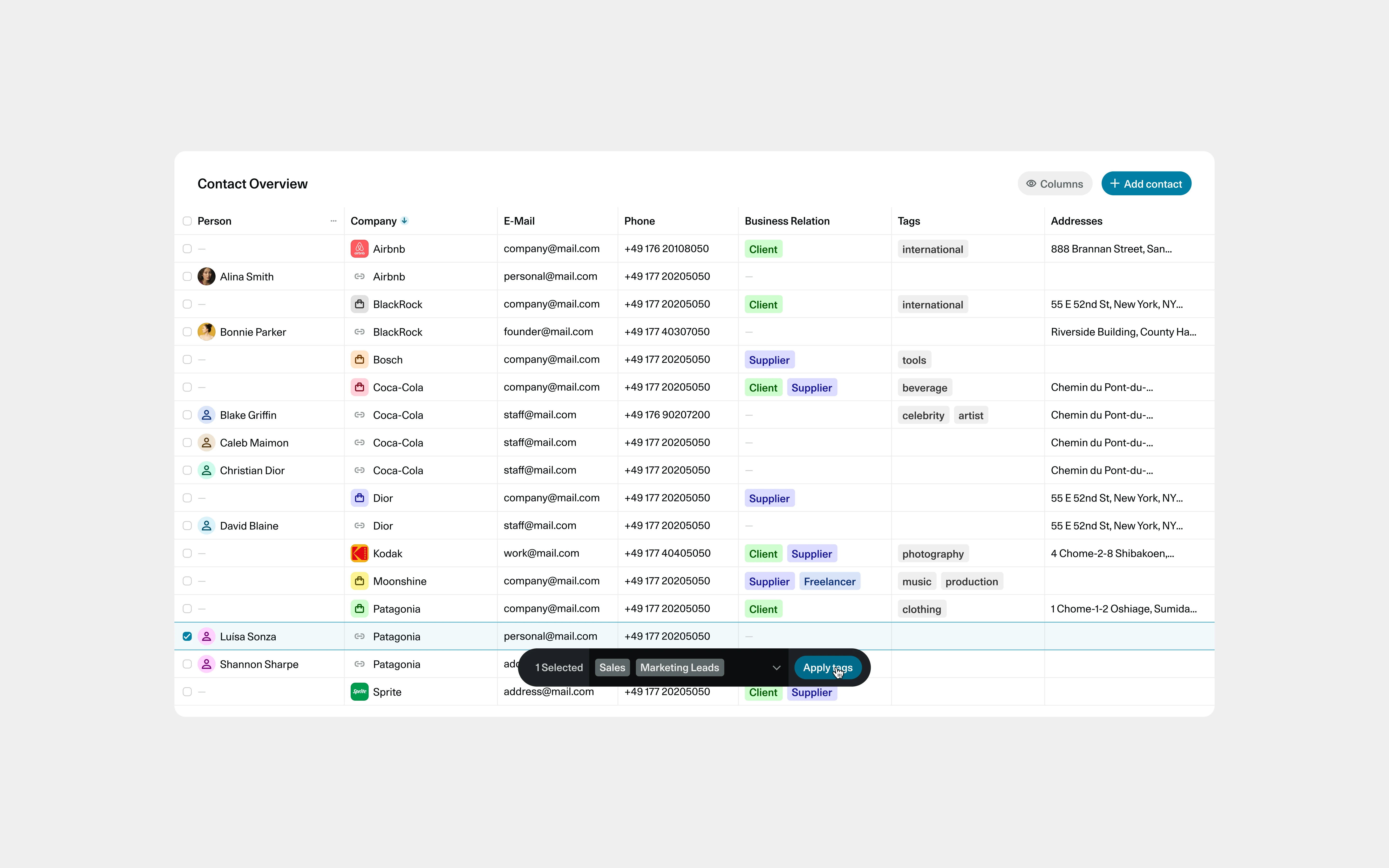
OS contact overview showing companies, people, business relationships and tags
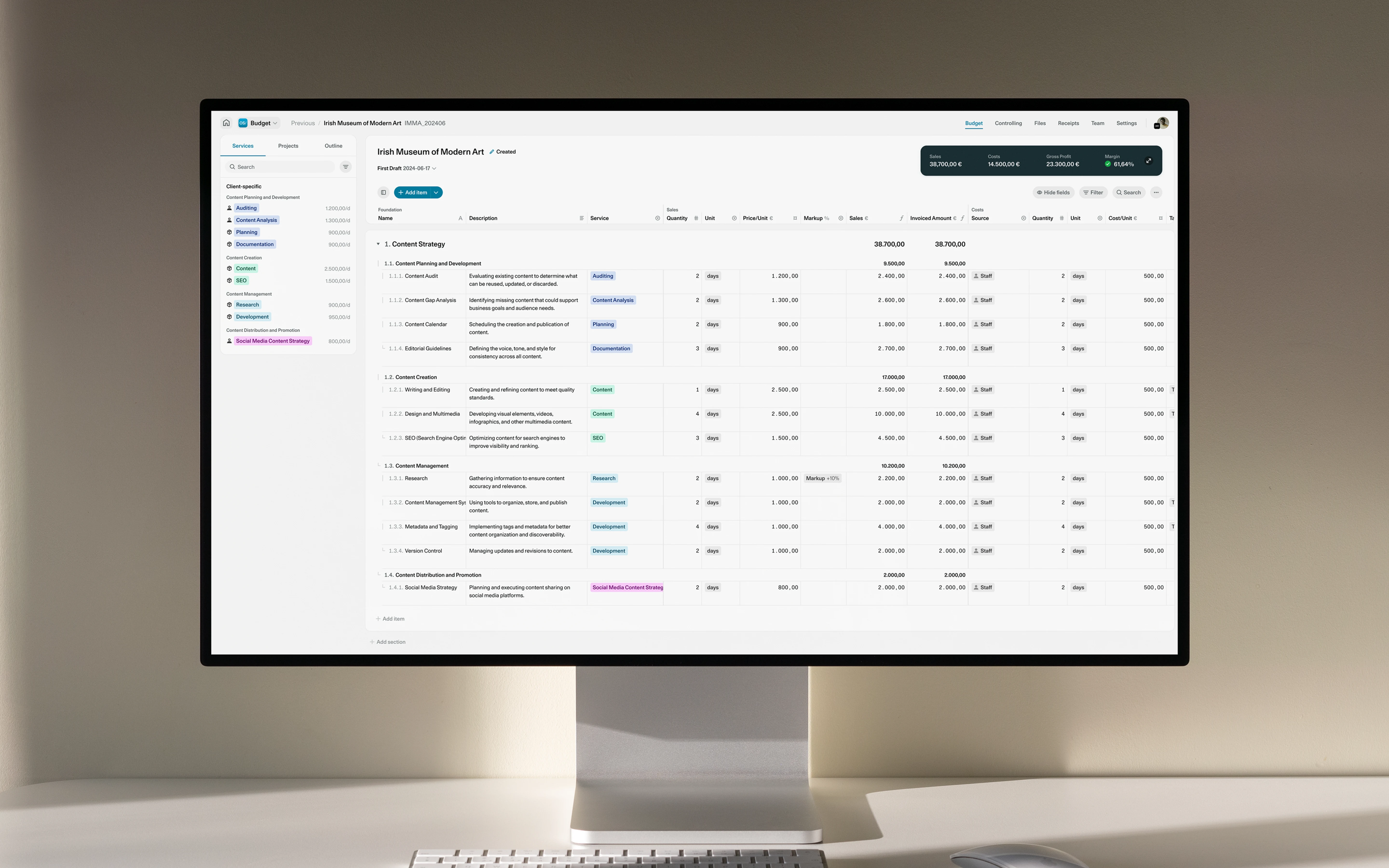
OS project budget interface displayed on a desktop monitor

OS/

OS/ is a comprehensive software suite designed to help agencies track project profitability and business success.

Introduction & Context

OS/ began as a set of internal tools created by agency founders who wanted a clearer view of project profitability and the wider health of their businesses. We worked with the team as the product evolved from something used internally into a comprehensive software suite for the wider market.

The challenge was to make complex financial information feel approachable while creating a flexible design foundation that could grow alongside the product.

My Role

I was responsible for building and maintaining a complex design system spanning four key platforms within the suite. I designed reference screens and data visualisations that established how the system should work in practice, bringing the clarity and utility of a mature SaaS product to a large amount of financial and operational information.

Alongside the hands-on design work, I managed the day-to-day client relationship—turning feedback and evolving requirements into clear priorities for the team. I also supported a junior designer throughout the project, providing direction and feedback while helping them take ownership of their work.

Design Approach

We approached the suite as one connected system rather than four separate products. Shared foundations created consistency across the platforms, while flexible patterns allowed each one to respond to its own workflows and types of information.

Reference screens were an important part of the process. By applying the system to realistic, data-heavy views, we could test hierarchy, density and interaction early rather than resolving components in isolation. Data visualisations were designed with the same principles: making complex information easier to compare and understand without removing the detail people needed to make decisions.

The interface was kept purposeful and direct, with the familiar clarity of a SaaS product. This allowed the design to recede when necessary, giving workflows and information priority while creating a foundation that could continue to scale as the suite developed.

Takeaways

The project reinforced that maintaining a design system is as much about decision-making and communication as it is about components. Working across four platforms meant continually deciding what should be shared, where variation was necessary and how new requirements could strengthen the wider system rather than introduce exceptions.

It also developed my ability to lead across different levels of a project: maintaining a close client relationship, keeping the work moving and supporting another designer while remaining involved in the detail. The result was a more coherent suite and a design foundation capable of accommodating increasingly complex workflows and information.

Credits

Benjamin Rawn, Sebastian Druschel